Extending Porsche’s design system without breaking its grammar
Deconstructing a mature system, recomposing its parts, and adding one component that still belonged.
For an Interaction Design Methods assignment, I studied Porsche’s public web design system, rebuilt a homepage composition from its existing parts, and designed one new component. Making something that looks like Porsche is the easy half. The harder half is making something new that behaves as though it had been there all along.
Deconstruct before remixing
I began by identifying five principles in Porsche’s design language: monochrome interfaces, gently rounded geometry, generous space, reduced information, and iconic brand assets. These principles appeared in the components, but also in the relationships between them: image scale, button hierarchy, spacing patterns, and how layouts changed across viewports.
- Monochrome
- Rounded
- Space
- Reduced
- Iconic
The system was strongest when those relationships stayed intact across the main site. It was weaker at the boundaries: moving between Porsche’s main, shopping, and motorsport experiences made location and the path back less clear, even though the navigation looked related.
Recompose with the system’s own parts
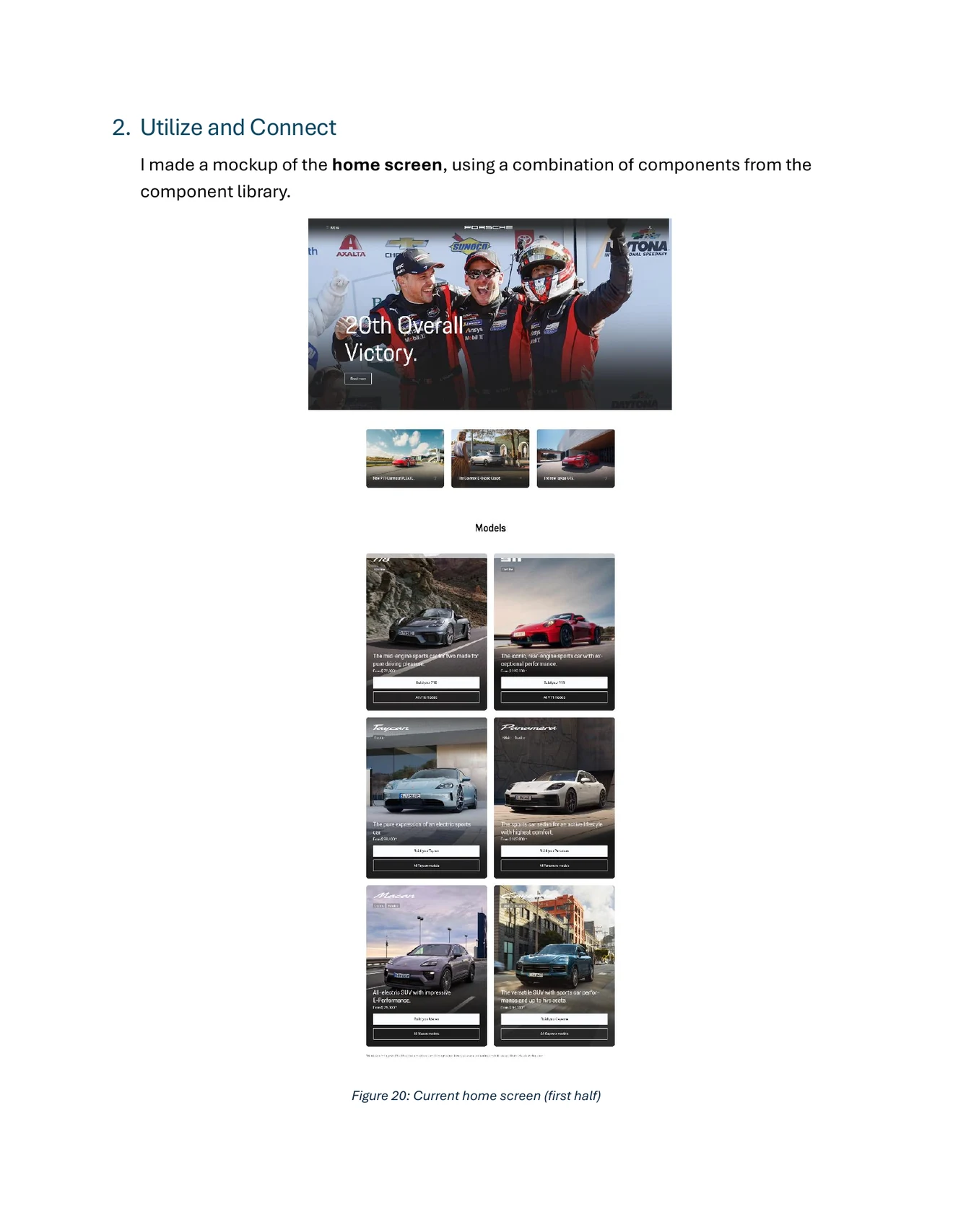
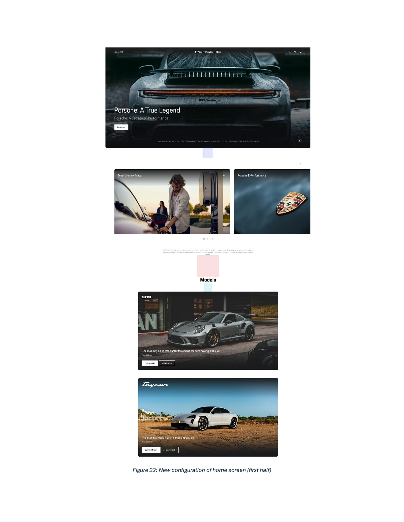
My first intervention was deliberately conservative. I rearranged the homepage using existing hero, spacer, carousel, teaser, text, heading, and footer patterns. The work was less about drawing new UI than choosing the right pattern for each content role.
 Open full-size
  Open full-size
 Spacing was the decisive constraint. Before I used the system’s spacer patterns, the page felt compressed even though the individual components were correct. Once the vertical rhythm and image ratios followed the system, the new sequence felt considerably more coherent.
Extend only where a real gap exists
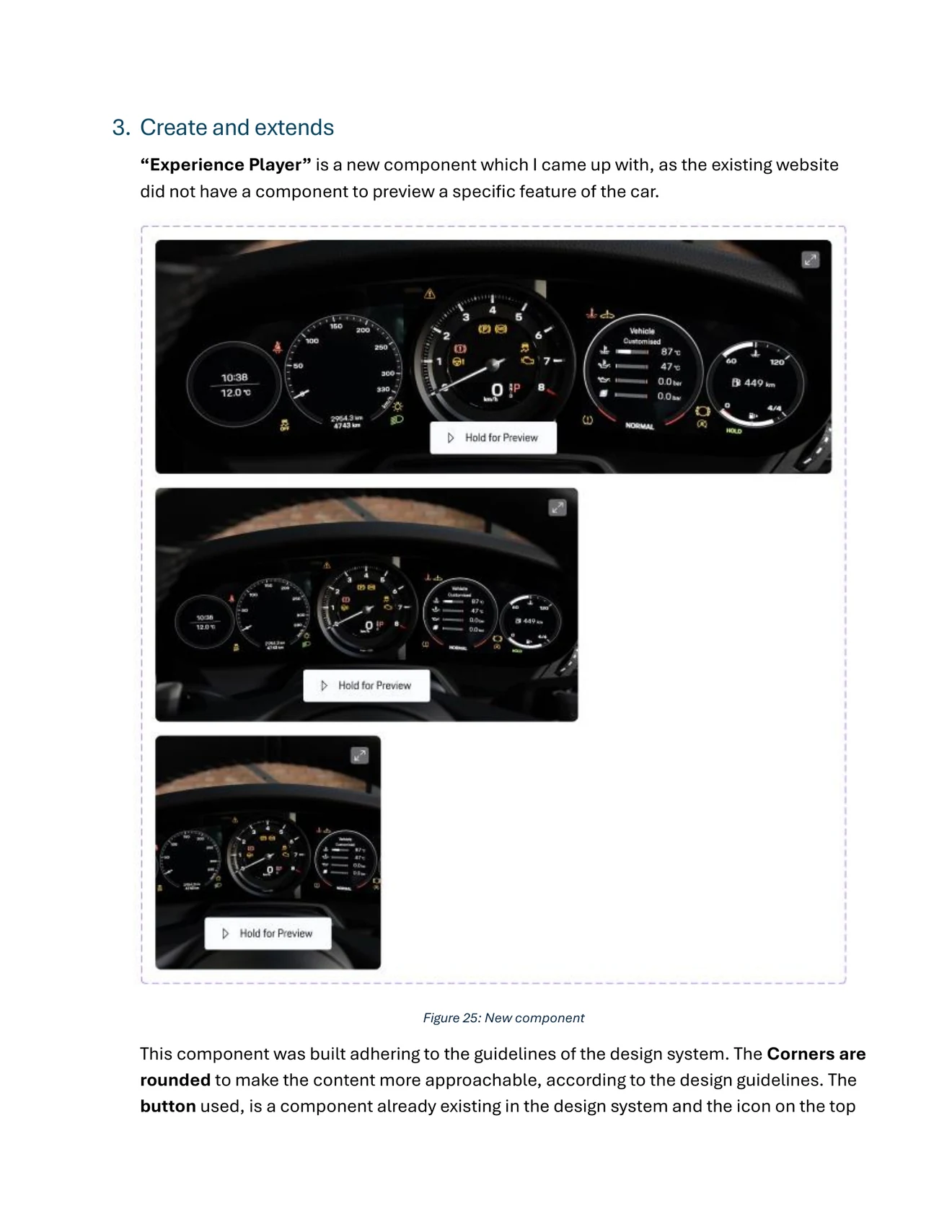
The existing site could describe a feature, but it did not have a compact way to preview how that feature felt. I designed the Experience Player: an interactive video component for moments such as acceleration, where motion carries information a still image cannot.
 Open full-size
 The component reused Porsche’s button and icon primitives, rounded corners, monochrome surfaces, and approved contrast colors. Its main interaction was hold to preview, with an expand action for a more immersive view. I defined large, medium, and small variants rather than shrinking one desktop composition until it broke.
Document the behavior, not only the pixels
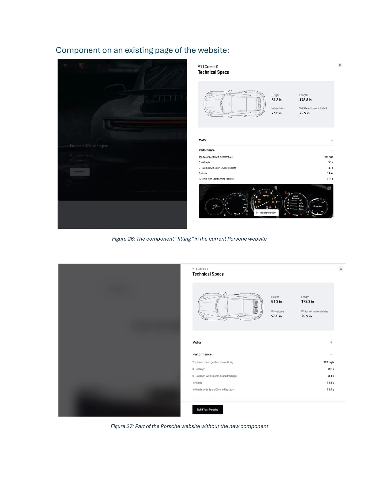
Porsche’s system documented principles and patterns well, but I could not find a complete documentation template for an individual component. That absence became part of the exercise. I wrote the Experience Player’s purpose, breakpoints, usage guidance, do’s and don’ts, and its two interactions.
Features whose value becomes clearer through a short, focused motion preview.
Maintain contrast, use high-quality video, and give the player enough space to become the focus.
Place it in a crowded region or use video where a still image communicates the same thing faster.
 Open full-size
 “A design system is less a box of matching parts than an agreement about how the next decision should behave.”
What I carried forward
The exercise made the hidden labor of a mature design system visible. Variants that appear effortless in a final interface depend on detailed constraints, naming, responsive behavior, and documentation. When one footer variant would not switch cleanly in Figma, the component itself was fine. What was missing was any guidance for someone meeting it from the outside.
I left with a stricter standard for extensions: understand the system at multiple scales, reuse its primitives, add only the behavior that is missing, test the new piece inside a real page, and document enough that the next designer does not have to reverse-engineer the same decisions.